A brand new business born by geologist and crystal expert, Emily Coulter, Crystal Case Studies aims to help businesses that sell or use crystals holistically, by arming them with in-depth geological knowledge about crystals origins.
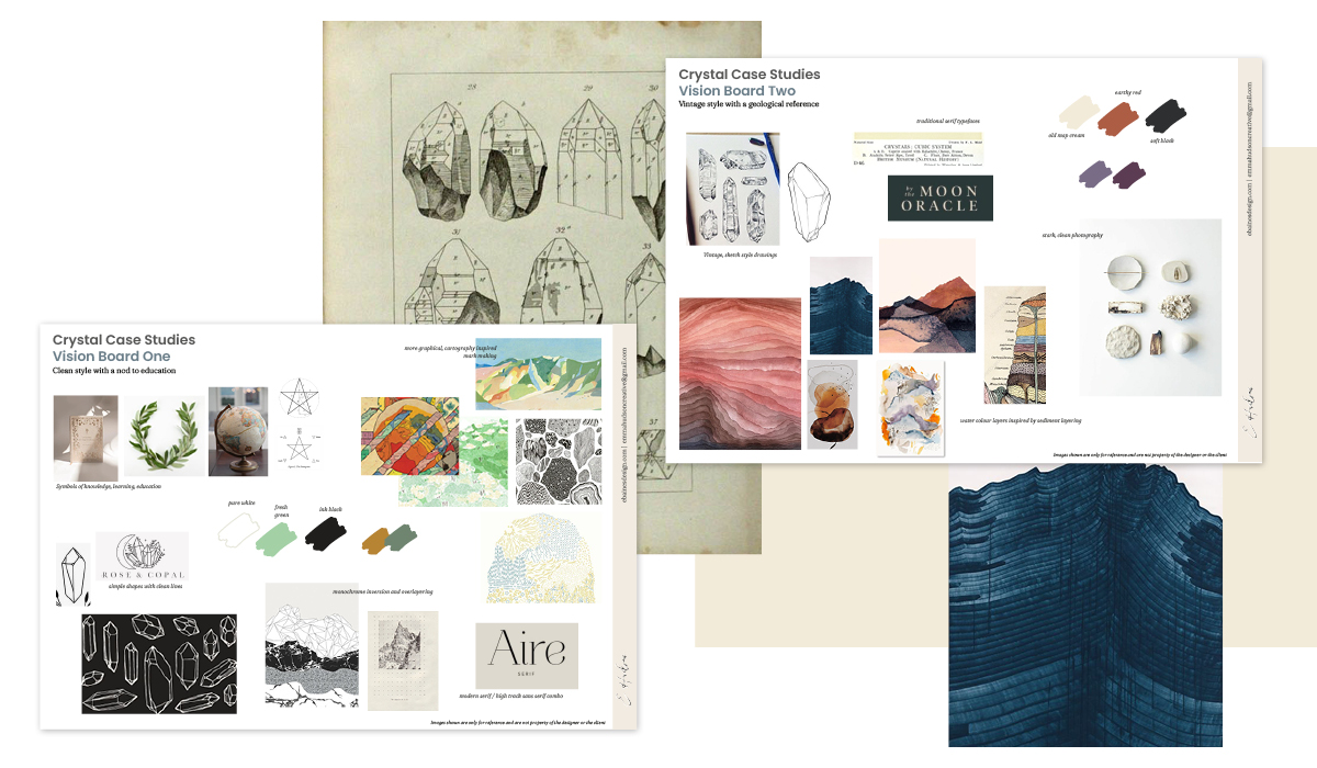
Targeted at two specific audiences; retailers and holistic therapists, the brand needed a look that quickly communicated education in the geological sector. Presented with two options exploring each route, Emily chose to merge elements of the two stories.
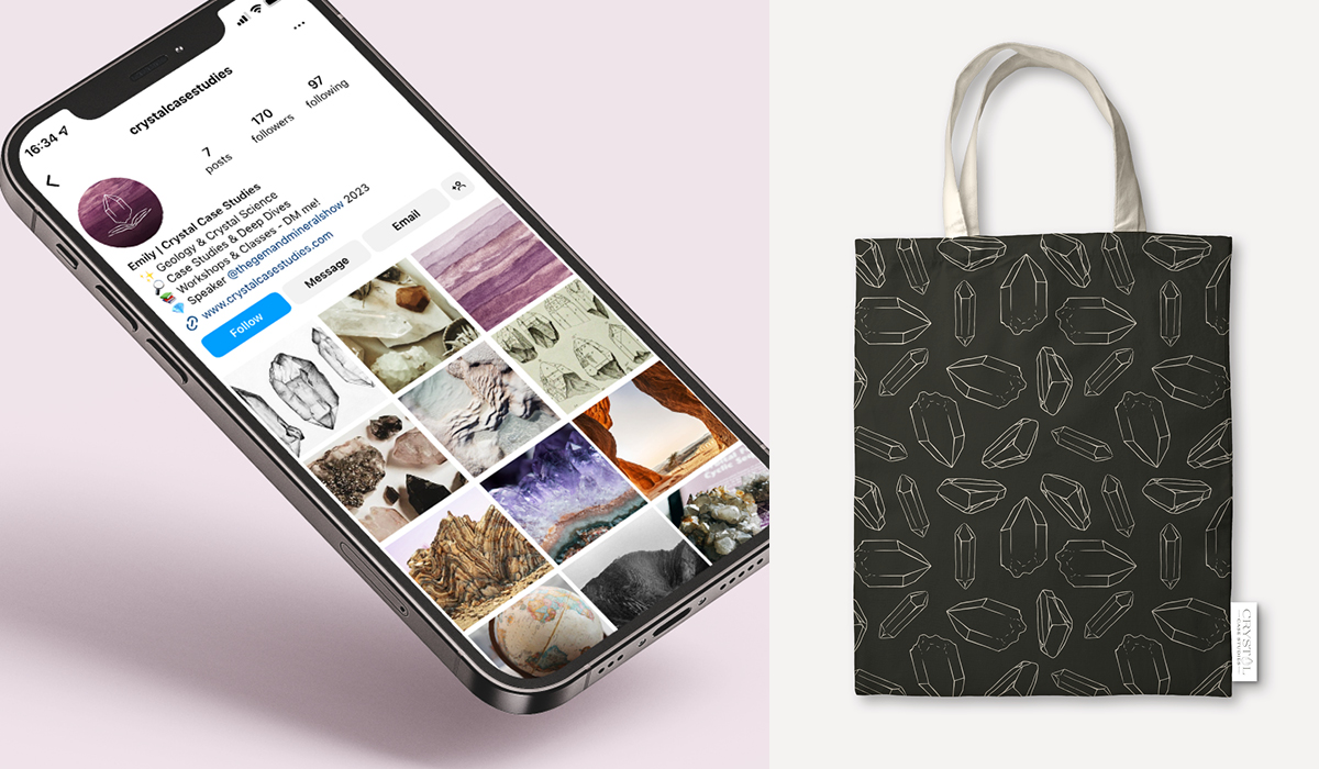
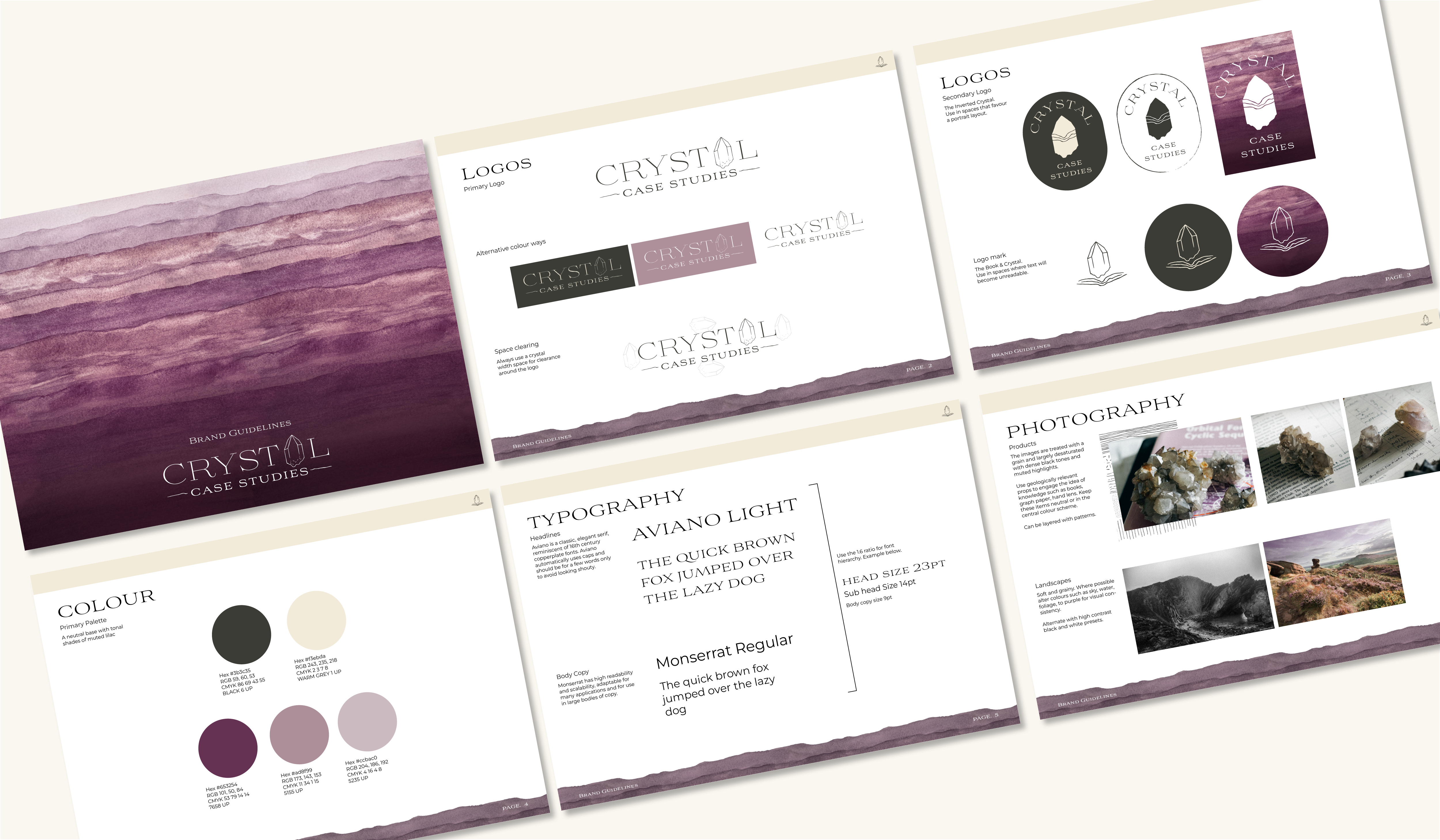
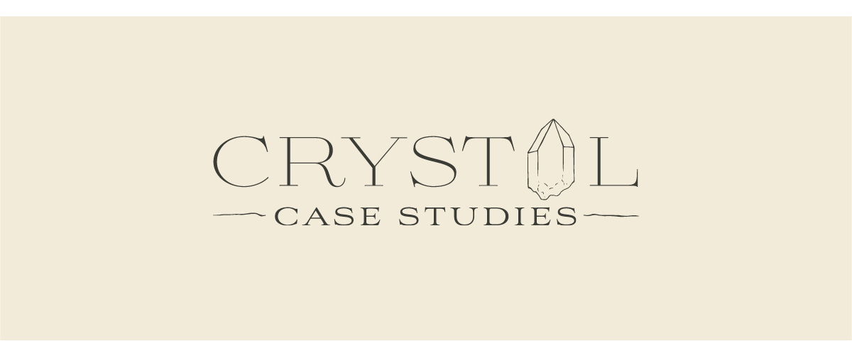
The main logo utilises a typeface that echos the style of typography found in traditional geological mapping journals. Intergrated is a hand drawn crystal replacing the letter A, a symbol which carries through the entire brand system. The secondary logo combines the Crystal and a stylised open book, creating the connection between education and geology.
To create a seamless pattern which could be used across multiple assets, I used watercolour painting to create a reflection of the layering on sediments in rock formations. This gives the brand a completely unique and more organic look, playing back into the geological references.
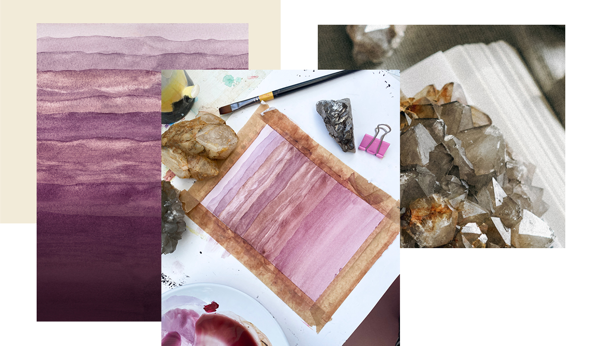
The colour palette is derived from the natural purple tones of the Amethyst crystal, known for its calming properties, a sense that Emily wanted clients to get when interacting with the brand. She was clear she didn’t want people to be intimidated by the science and rather enjoy the journey of discovering stories behind the rocks that they use or sell in their everyday businesses.