
Cath has an absolutely beautiful salon set in a quiet corner of Penryn in a purpose built cabin. She felt her current branding didn’t reflect the serenity and professionalism of her space and services and wanted it to attract a more high end clientele who would buy into her more prestigious treatments.
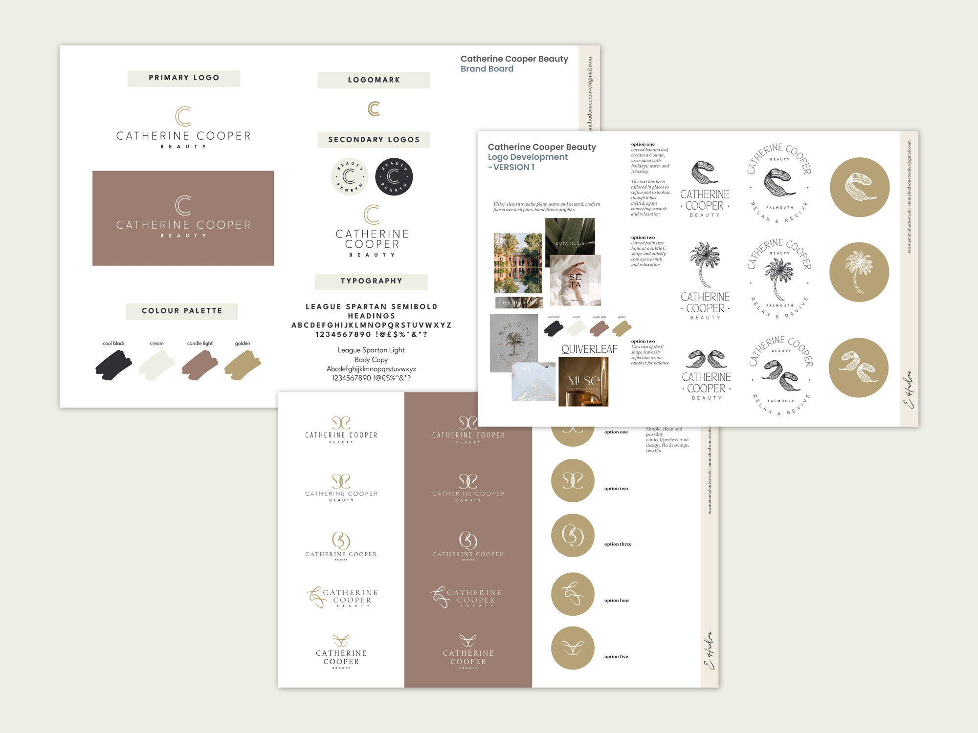
After a few options for new logos, Cath settled on a super simple double C. The other options lent into the relaxing atmosphere the salon is unique for and a nod to the beach just down the road. The double C is clean and doesn’t distract from the otherwise long name of the brand. I also created smaller secondary logos and a stacked version to ensure readability in smaller or narrower spaces.
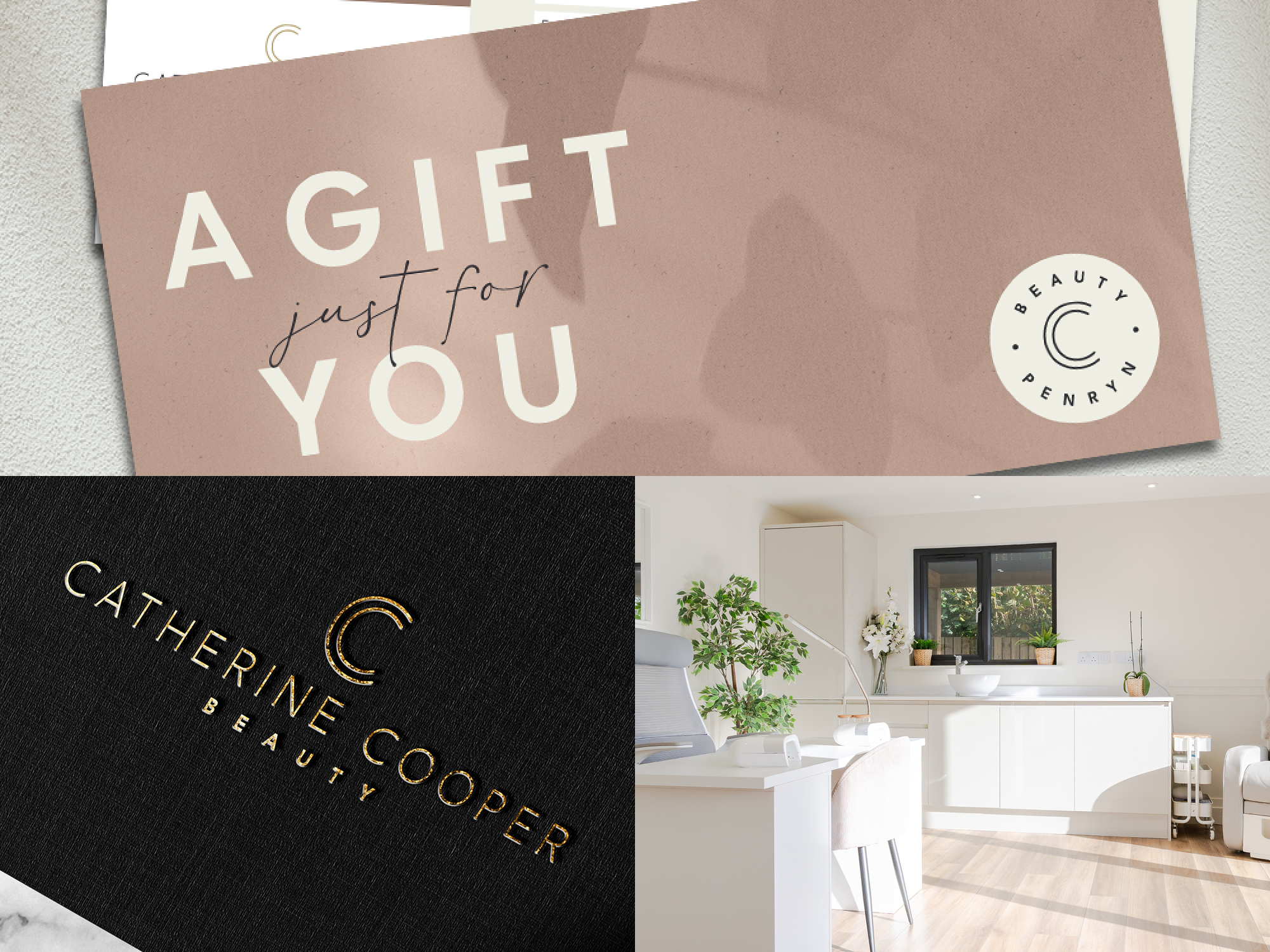
The chosen colour palette reflects the warm and relaxing atmosphere of the salon with rich gold and dusty pink set against the clean neutrals of white, cream and cool black. The typefaces used are also clean and tie in with Cath’s most popular products from Decaar, seen around her salon. A chunky League Spartan for headlines in capitals and light version for body copy. We also introduced a script font for accents such as sing-offs on social which gives a more personable feel.
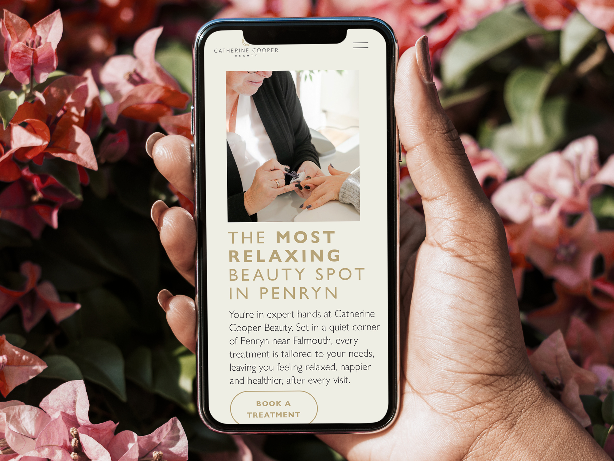
Cath’s website was already hosted on Squarespace but I built this new version from scratch to ensure every part worked flawlessly and looked amazing. SEO is integrated throughout with targeted location and treatments based landing pages and a dedicated ‘Beauty Journal’ section which allows blog-type pieces with more in depth written content.
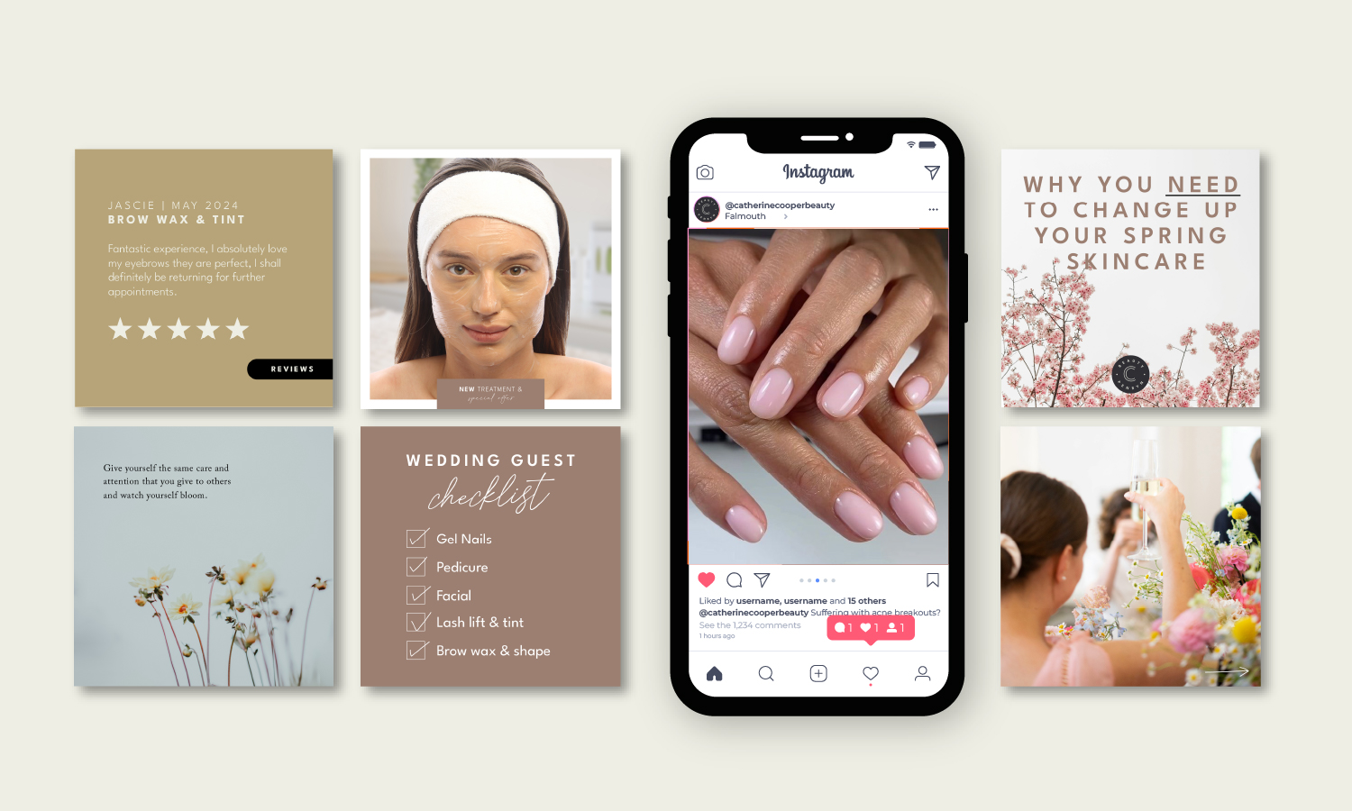
I also design the content for Cath’s Facebook and Instagram social feeds. This ensures a consistent look and feel as well as interspersing a variety of sales and entertainment based content to attract new customers as well as educating an informing current clients.
