
When it comes to choosing colours for your brand, the process can feel both exciting and overwhelming. With so many options available—not just in the colours themselves, but in the combinations and the number of shades to include—it’s easy for the process to become unfocused. Without a clear strategy, many businesses end up choosing colours based on instinct or personal preference rather than what will actually support the brand.
Most common mistake I see brands make when choosing brand colours:
- Relying on personal taste to choose your colours
- Choosing colours because another brand is using them
- Using colours that are the ‘industry norm’
- Mixing a palette which has too many variables
- Thinking ‘eye catching’ means overtly bright colours
The problem with these approaches is that those colours may not truly connect with your audience. Poor colour choices can create confusion about what your brand represents, leaving potential customers unsure, disengaged, or even mistrustful. Your brand palette plays a significant role in how your business is perceived—it should resonate with your audience, communicate the tone of your brand, feel professional, provide strong contrast for readability, and remain recognisable within your market.

Get useful articles just like this, every month, straight to your inbox.
How do you know if your current colours are working?
Are you confident they are backed by strategy? If they are a guess, or a feeling, or your personal preference, the answer may be no.
Do they give an essence of the core of your business? Not what you do – but why you do it. They should embody your vibe and fit with every touchpoint.
Do they attract the right audience? Not a generalised demographic but a really specific type of person whose beliefs values and needs align with what you are selling. Do you know exactly who this is and what will resonate with them?
Are they different enough from your competitors that you are memorable and recognisable within the crowded market place?
Do you have so many colours in your palette that every time you design something, it looks like a different brand? Instead of strengthening your brand, the endless combinations can start to make it feel scattered and unrecognisable.
How to choose brand colours
This is the exact process I use when putting together colour palettes for brands.
1. Strategy-led
Always start with your brand strategy. If this plan isn’t in place, everything else falls apart, there will be a lack of consistency and purpose that make it really difficult for you to be confident that the decisions you are making are in the best interests of the business. You need to be able to put yourself inside the mind of the customer and see what is going to meet them where they are right now, you can’t do this without absolute clarity on who your audience is.
2. The connection
Deduce the type of palette that is both representative of your business and appealing to your customer. Try using general terms to start rather than specific colours like ‘warm’, ‘gentle’, ‘energetic’, ‘serene’, ‘fresh’, ‘striking’, ‘earthy’, ‘joyful’.
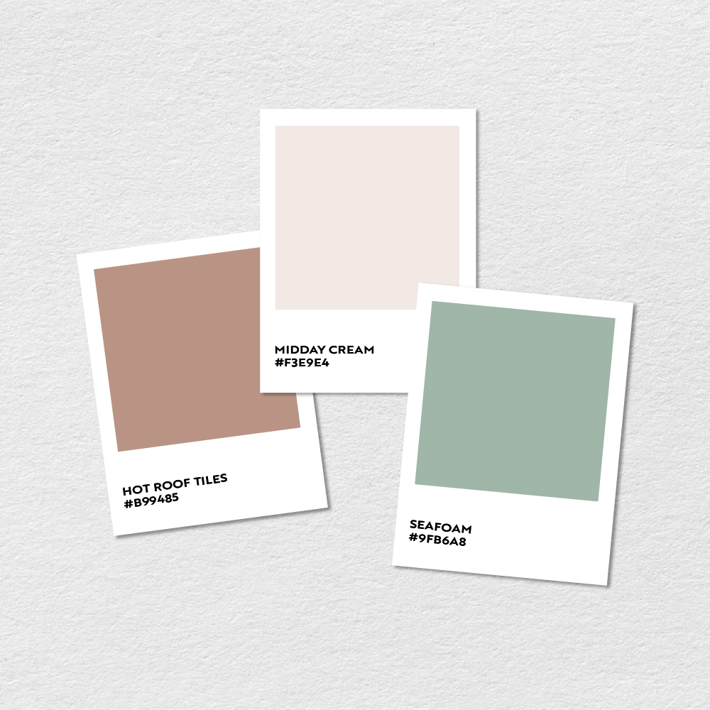
3. Primary Palette
Start with a hero colour. There really is no strict rules when it comes to whether you need one or more hero colours, this is entirely based on what suits your brand and what support that hero colour needs. Sometimes a really strong hero is enough on its own and can be supported by neutrals and shades. If more colours are needed, you can try these out using different colour harmonies, there are powerful tools in Adobe software to help with this to easily compare harmonies such as triad, complementary, analogous and monochromatic guides.
4. Secondary Palette
Shades of the primary palette. These support the hero colour by essentially being the same colour but lighter or darker or with varying degrees of saturation. This creates a complimentary look that doesn’t fight the other colours but still gives you more to play with.
5. Add neutrals.
Shades of white and black aren’t absolutely necessary if they don’t fit your brand, but they are usually needed in order to balance out stronger colours. Most brands will benefit from keeping solid black and white in their palette as they are timeless and create great contrast and readability. Others may find that off-white and softer black works better with their style.
6. Balance
Your strongest colour needn’t be the most dominant. Sometimes it can be more effective to use a strong colour sparingly and keep neutrals as the main players in the palette. For some brands however, the colour most used might be really strong – deep or vivid, that might be what suits their audience and that’s ok too, just make sure there aren’t as many other colours in the palette to fight with it. This is about tuning the levels of how much each colour is used in relation to each other.
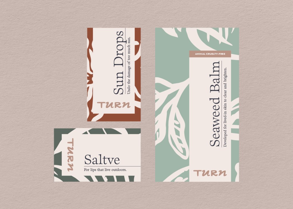
7. Put it in-situ.
Pull together mockups of the most commonly used brand assets and try out your selected combinations to check that they work in real live situations. It’s a great way of weeding out palettes with weak contrast or ones that may need an extra colour to strengthen important areas.


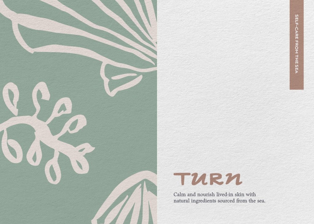
Your colours will need careful refinement to create a palette that feels cohesive and works across every touchpoint with clarity, readability, and recognisability. A strategically crafted colour palette can take a brand from forgettable to distinctive, and from unpolished to professional.
If you need help not just with your colours but your entire brand strategy and system, I offer a creative helping hand to small businesses that want to use their branding as a business tool to help grow and retain their audience.